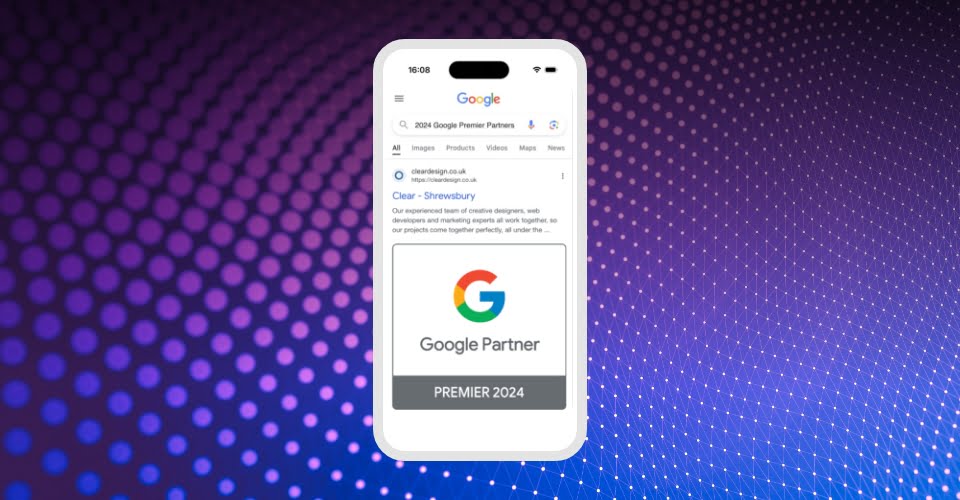
If you have a website built by us, have you ever wondered how your website looks great on mobile screens, tablets and desktop PCs? This is because we design our websites to be responsive – they adapt to the devices that’s viewing the website. We do a core design and then modify it so the website looks great when the elements move around.
In fact, sometimes we design a website for mobile first. Why? Because 57% of all web traffic comes from mobile devices.
‘Why should my website be mobile responsive?’
If your website isn’t mobile responsive, it should be. Here’s two reasons why:
1. Google
Google is a reason – of course, it is! A ranking factor for Google is how mobile-friendly your site is. If your website isn’t mobile responsive, it can appear lower down the search results and struggle to be found. It’s really as simple as that.
One of the ways that Google decides on how mobile-friendly your website is, is how quickly it loads. Google knows more than half of the users on mobile will leave a website if it takes more than 3 seconds to load. So even before a user has had a chance to see what’s on your website, after 3 seconds they’re on to the next website – your competitors!
There are many other reasons why Google favours mobile-friendly websites, in fact, see here, but speed is one of the main factors.
In July last year, Google released “mobile-first indexing”. Google will start looking at mobile versions of a website first. Now, this only relates to new websites – old websites will still be crawled as they used to be until they’re ready for mobile-first indexing. However, it shows Google’s increasing focus on mobile.
2. Mobile users more likely to buy
Studies have found that mobile users are more likely to buy something – 15% of desktop users are likely to buy online at least once a week, compared to 35% of mobile users.
You may be thinking this doesn’t apply to you as your business is mainly B2B – your customers buy from the desk using their computer at work. This could be true, but it’s a risky approach. B2B users often research things on mobile devices first. People expect certain features or functionality from a website, and websites that look dated or lack modern features are less likely to convert.
Having a mobile responsive website is cost-effective, helps future-proof your website and ensures consistency across devices.
How do I make my website mobile friendly?
Unfortunately, we can’t click a button and, whoosh, your website is now mobile responsive. It takes a little more than that.
We get our developers and designers together to ensure your website is mobile-friendly. The designers will look at the user experience, change the size of the text, make the design more image-focused, build in clear calls to action, and ensure you have a consistency across devices. The developers build the designer’s vision while making sure the site is technically suited for mobile and loads quickly.
Google found that 61% of users are unlikely to return to a website if they found it difficult to use. Do you feel like your website needs some mobile attention?
Want to know more? Get in touch :)