So let's look at some simple ways to make sure your forms are as effective as possible.
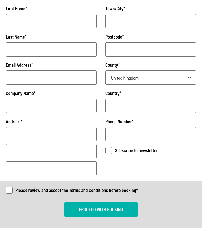
The example below is a pretty standard-looking form, asking for common information, nothing that you wouldn't find anywhere online.

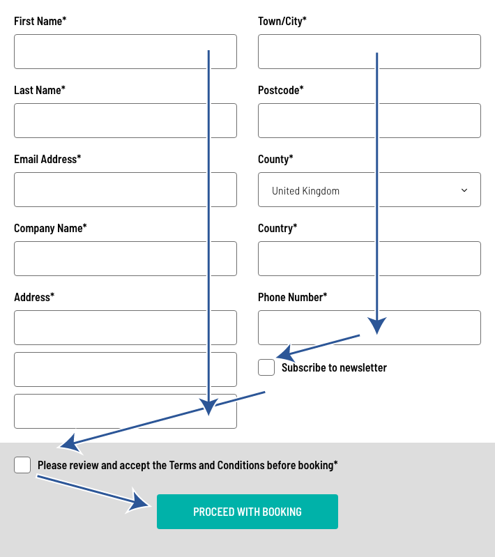
That's all good a well, but one of the main issues with forms that are split over two columns is how on earth do you fill the thing out? Do you go down the left column, then bounce to the top of the right, down that column, shoot off to the left for the T&Cs, then back to the right for the all-important button?

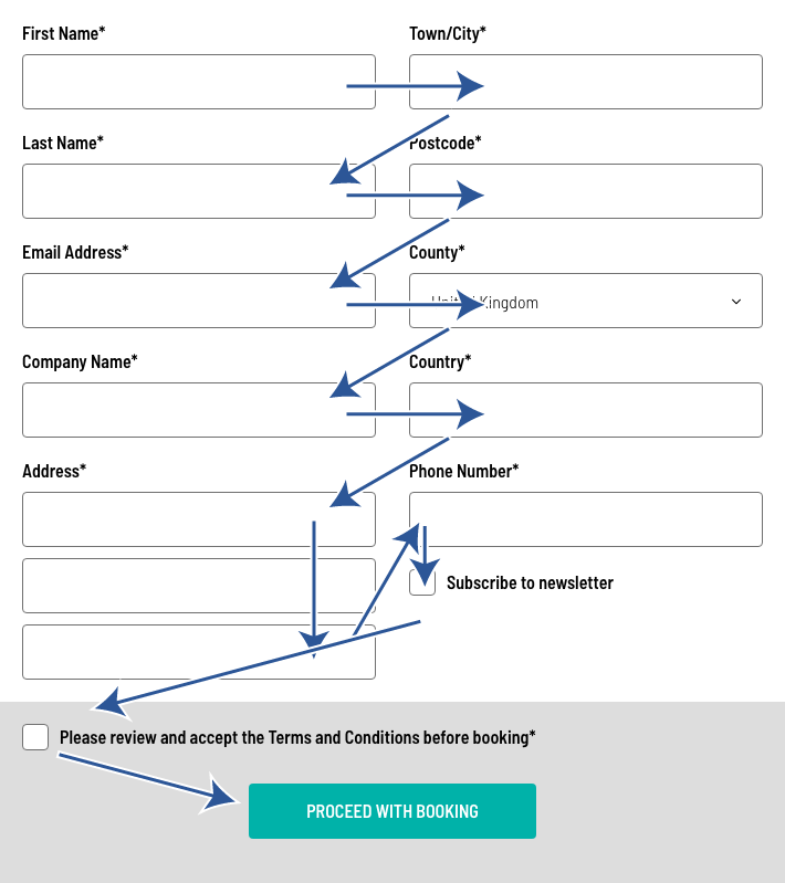
Or, do you zig-zag your way through the whole thing, endlessly flicking left and right until you reach the promised land ofthe button?

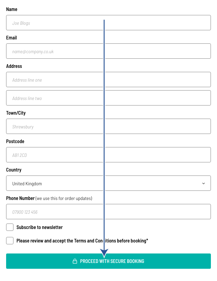
The example below takes the same fields as above and rearranges them into a single column. Instantly making things easier to understand and complete, aligning all of the form labels (First Name, etc) reduces the cognitive load on a user, and a single linear process increases the likelihood of completion.
For this form, we've also looked at what information is actually required and only asked for that. Adding in-line prompts can hugely help users, as they indicate what type of content is required. Explaining why you may need more sensitive data is also key, in a world where people are increasingly skeptical about giving their data away. One final thing to consider looking at is the button micro-copy (text). This is a key place to instill trust and belief. If you have a secure checkout, don't forget to tell people about it, Proceed with Secure Booking" is far more trustworthy than "Carry on" :)
Combining some of those improvements will not only make your forms easier to complete but will also increase conversion rates. The final example below reduces the number of clicks by 25%.

Our top five tips are:
- Focus on the data that you actually need
- Ensure that all form labels are left-aligned
- Add in-line prompts
- Explain why you need more personal data
- Switch to the correct keyboard type on mobile


