Sarcoma UK is a charity that offers support for anyone impacted by sarcoma, as well as funding vital research and campaigning for better treatments. Sarcoma is a type of cancer that affects bone and soft tissue and can appear anywhere in the body. It’s often difficult to diagnose and can be even harder to treat. Sarcoma UK relies on donations to work towards its vision: where everyone affected by sarcoma has the treatment, care, and support they need.
Our Creative Director, James, turned to the Sarcoma UK website in March 2023 after being diagnosed with synovial sarcoma in his right calf. Following his surgeries, he wanted to return some of the support he received by offering his services in the form of a UX audit.
The brief
Sarcoma UK’s website users are incredibly important to the charity. They’re often people going through life-changing events, under a lot of stress whether they’re patients, family, or friends. Therefore, the site needs to be easy to use for someone in distress, while still providing all the information they could need or want. It also needs to cater to fundraisers, other volunteers, and researchers.
Following a short UX video review, the charity was interested in a more in-depth UX audit. In particular, difficulties users may have been having with the mobile version of their site. We devised a tailored strategy to tackle this, including an accessibility review, an information architecture review, customer journey mapping, and usability testing.
Accessibility Review
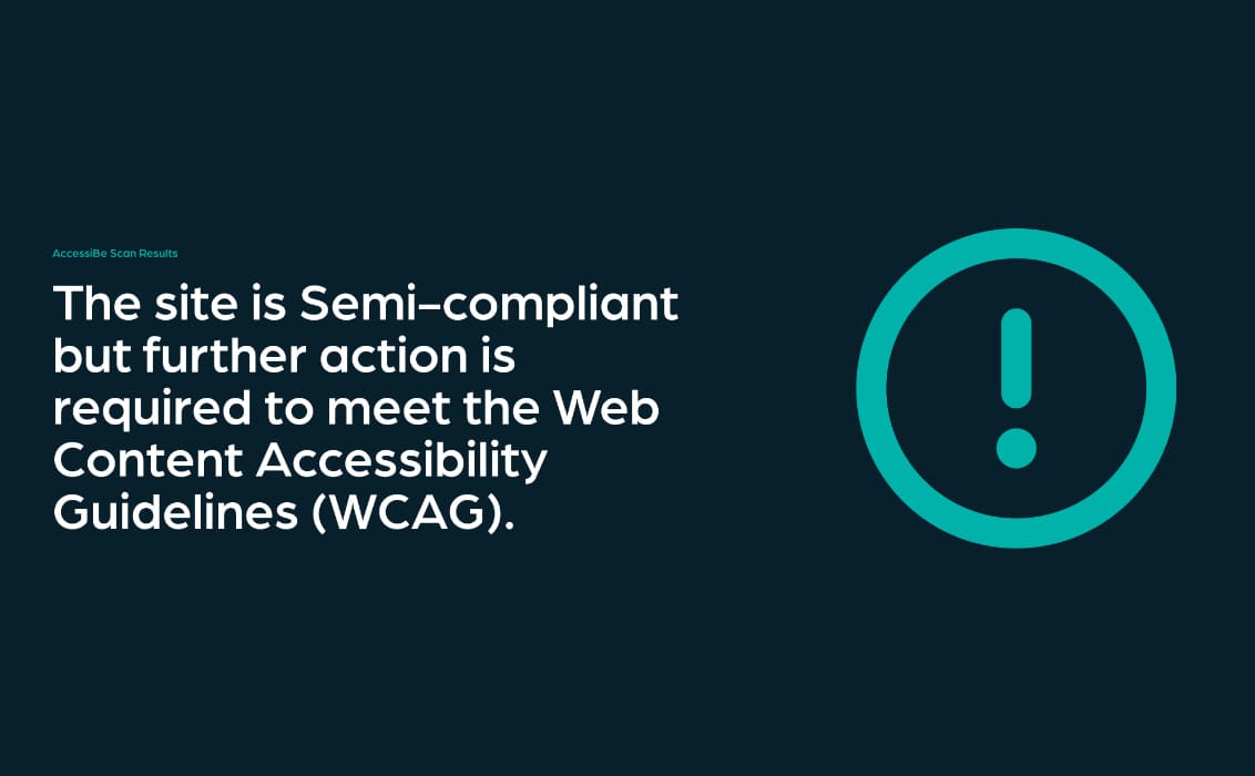
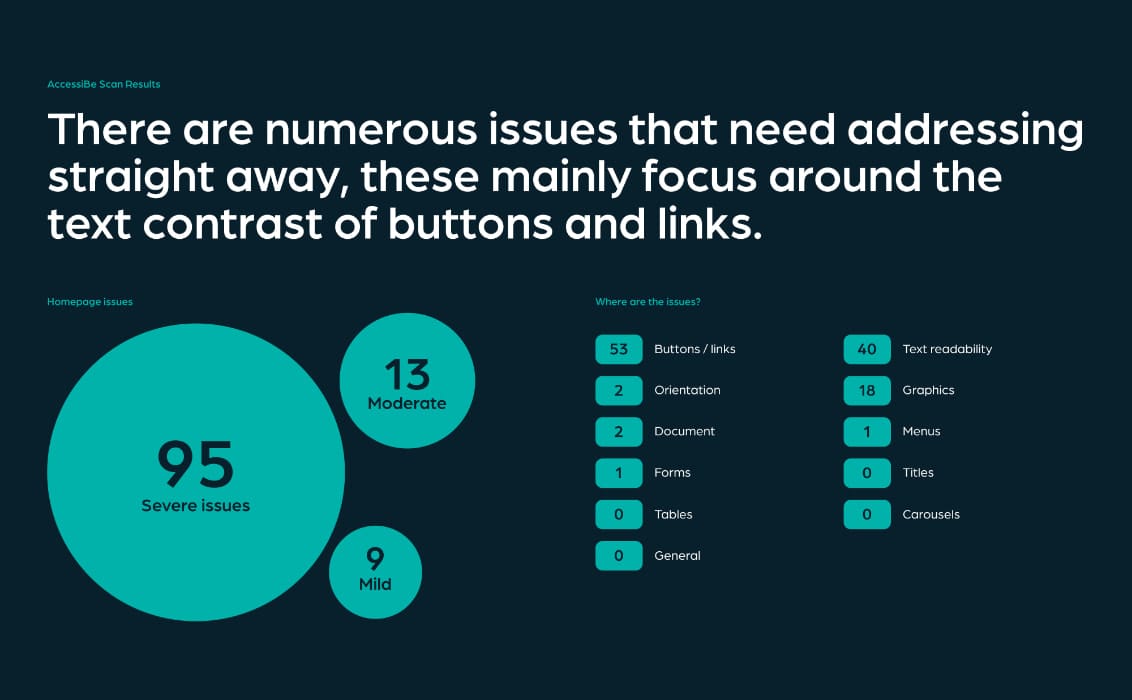
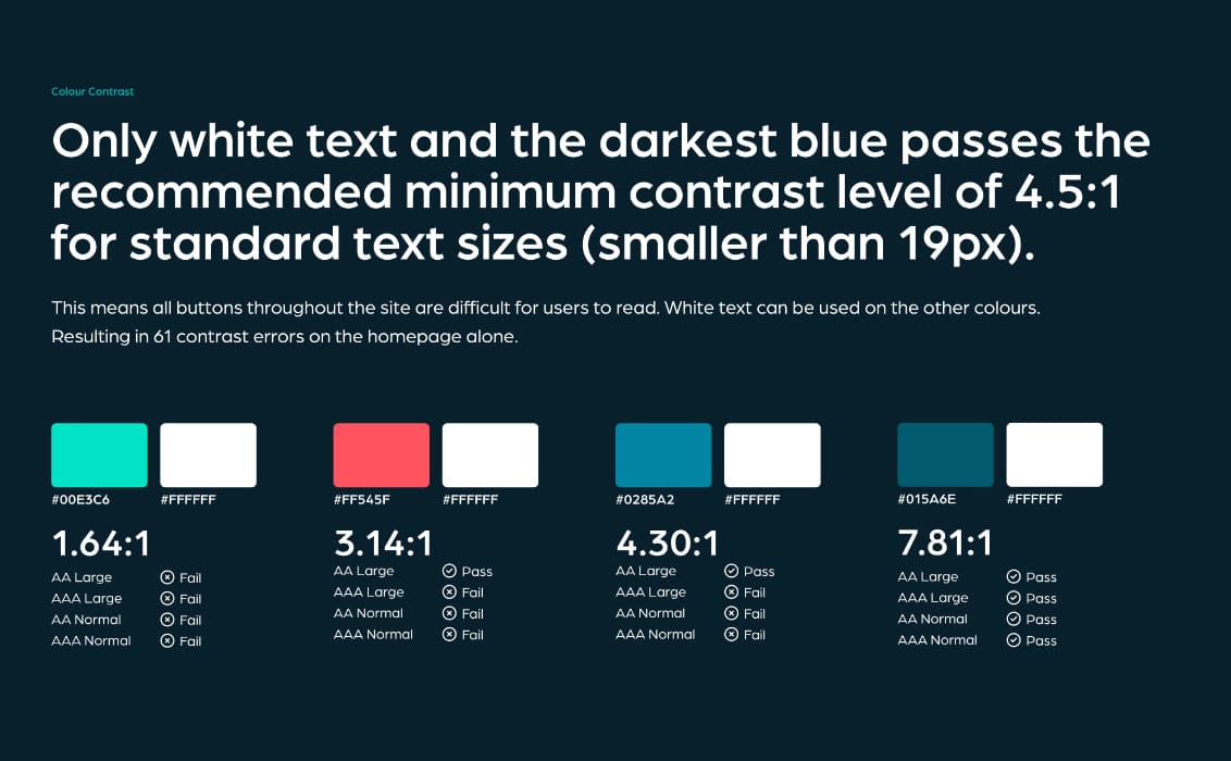
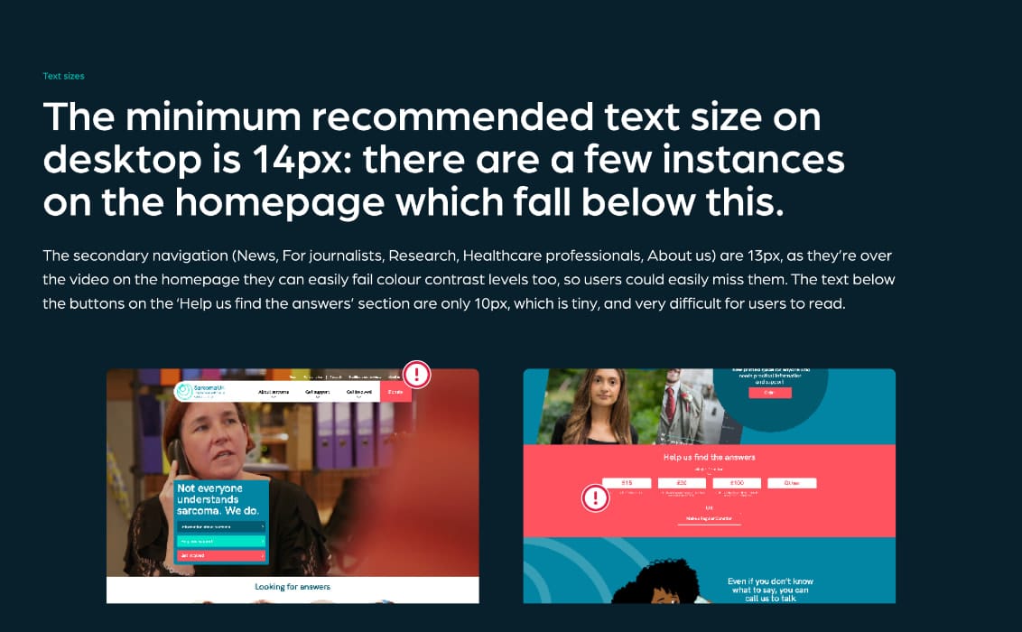
The first step in our strategy was an accessibility review. This was completed with help from the AccesiBe extension, which measures how compliant a website is with the Web Content Accessibility Guidelines (WCAG). This is a great tool that helps highlight accessibility gaps to improve on. The main issues found focussed on the colour contrast of buttons and links, which were causing readability issues. This review found 95 severe issues on the homepage alone, 61 of which were colour contrast errors. Only one of the button colours on the whole site passed the recommended minimum contrast level for standard text sizes.
Usability Testing
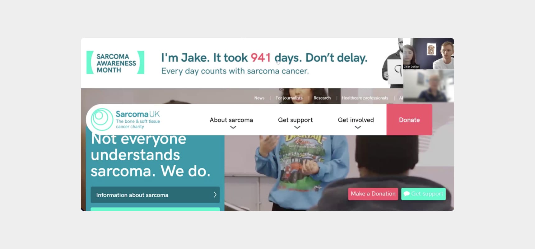
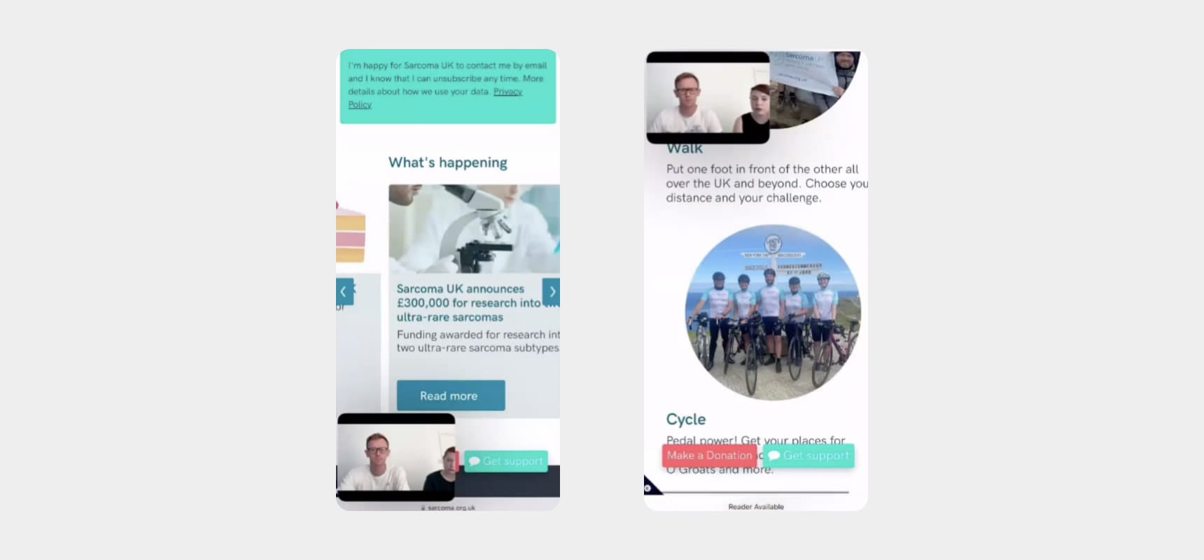
The next step was usability testing, for which we recruited participants through the Sarcoma UK participation network. Our five participants each fell into user personas previously defined by the charity: healthcare professionals, those living with and beyond sarcoma, people in treatment, those newly diagnosed, and community fundraisers.
Each recorded Zoom session lasted around 50 minutes and included users completing set tasks whilst voicing their thoughts and feelings surrounding their experience. We assured the participants that this was a test of the site, and not them, so there wasn’t a way to get a task wrong. Our aim was to highlight and summarise a deeper understanding of the audience’s goals and pain points.
This was an enlightening process – it was amazing to see how differently the users interacted with the site. Each user had valuable insights on different areas of the site, both positive and negative. This also highlighted the importance of usability testing with users who don’t work in digital. By engaging with users from more diverse backgrounds we provided fresh insights and revealed challenges that had previously been overlooked. Some of the key takeaways from this process, includes ideas to change the donation link on the homepage, revamp the search extension, and update the shop functionality.
Customer Journey Mapping
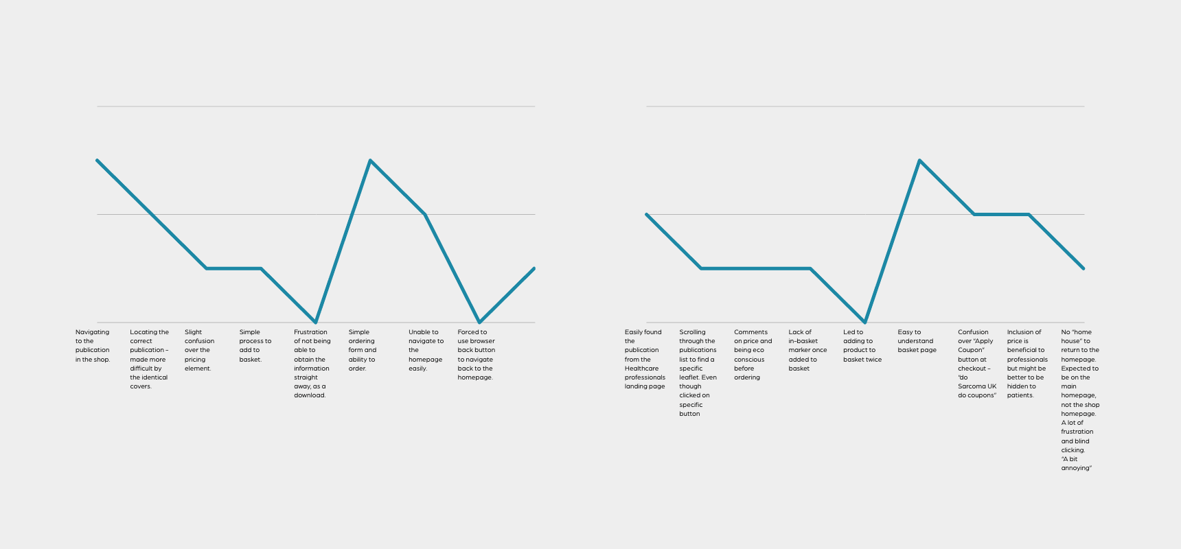
Following on from the usability testing we focused on a customer journey all users completed: navigating to the shop and ordering a printed booklet. For this, we created visualisations that showed user frustrations with various elements of this process. For example, all the participants struggled to navigate back to the homepage following the purchase, indicating a need to rework this part of the journey. On the other hand, our testing also showed that the actual ordering process was very simple – a high point in the user journey that was positive to see.
Information Architecture Review
One of the main issues we came across during our usability testing was users struggling to find relevant pages in the navigation, both on desktop and mobile. This was partly down to the function and look of the menu, and partly down to some of the naming conventions.
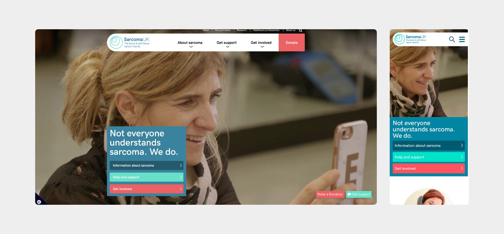
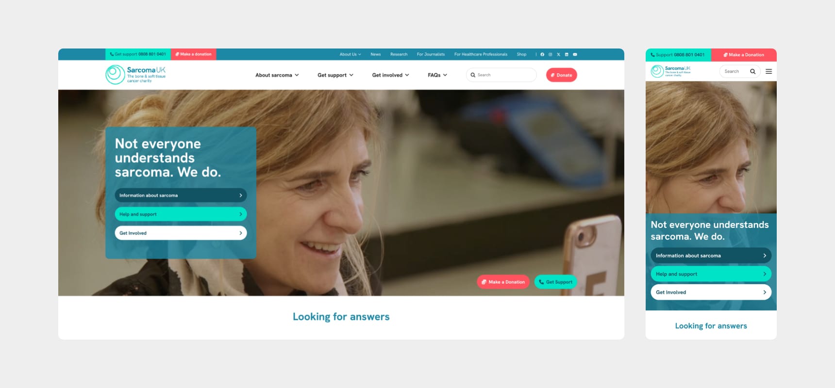
We took all our notes from the usability testing on board and created an updated sitemap that featured additional links, reprioritised and renamed elements. This was visualised in a high-fidelity mock up of a new navigation bar. The mock up included a full-width header to maximise the available screen real estate as well as an enlarged secondary navigation, as users struggled to find this during our interviews.
Current & Proposed Header
The results
In short, Sarcoma UK were thrilled. The report highlighted new issues as well as ones they had been aware of but never had time to look into properly. On top of best practice UX suggestions from our team, the usability testing provided invaluable insights. This was key in discovering how Sarcoma UK’s actual audience used the site and what needed to be changed, as well as what was already working! Our report included actionable priorities and recommendations for them to follow to improve the website.
Kind Words
Your clarity and thoughtfulness throughout have been very welcome. It's made what might have been a daunting process very smooth - thank you!
Enda Guinan, Digital Communications Manager at Sarcoma UK
Let’s chat
Want to take your brand to the next level with an experienced agency that does what they say they’re going to? Get in touch with our team today! We can discuss an upcoming project or simply chat about your business and suggest solutions for growth.
Call us on 01743 344 911, drop us an email or fill out our contact form. We’ll get back to you as soon as possible.
