Continuing our long-standing relationship, Morris Property tasked us with designing and building a new WordPress website.
Morris Property are renowned commercial and residential developers, constructors and property managers within the West Midlands. Encompassing all aspects of commercial and residential property, Morris Property’s team of experts have over 100 years of experience.
The brief
Morris Property identified a need to better serve their wide audience range. A new website with bespoke page templates would allow them to effectively target, engage and convert users with different requirements.
A user who wants to collaborate with Morris Property to develop a multimillion-pound project requires a different user experience than someone looking to rent a small unit. These different user profiles had to be catered for, whilst the consistency of the brand is preserved, strong digital performance is protected, and flexibility is incorporated.
A core element of this was the need to promote the prime properties Morris Property have available from the homepage. The objective was to drive enquiries for properties to Buy or Rent and to showcase properties that were coming soon, sold or already let.
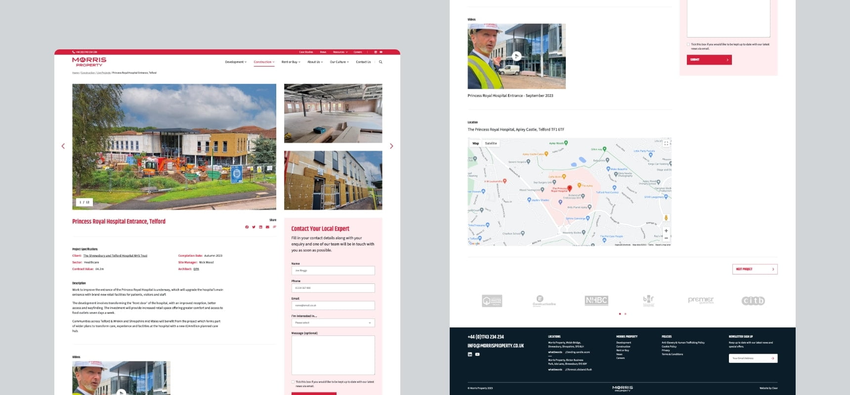
This needed to be supported on the main Rent or Buy pages. The templates had to support a lot of information in differing formats, including: specification downloads, 360-degree tours, copy, images and maps, and clear calls to action.
Finally, the core of Morris Property is their commitment to their team, their charities, their values and the environment. It was important this dedication to their CSR responsibilities was reflected and communicated on their website.
Our strategy
Visually, the existing website needed a design update/refresh. The fully capitalised, black text on the current site felt dated and a little too aggressive. To counter this, headlines were made softer, with generally lowercase titles and the introduction of a rich navy blue, which sits alongside the Morris red perfectly. This worked so well that Morris have since made the new blue a part of their corporate colours.
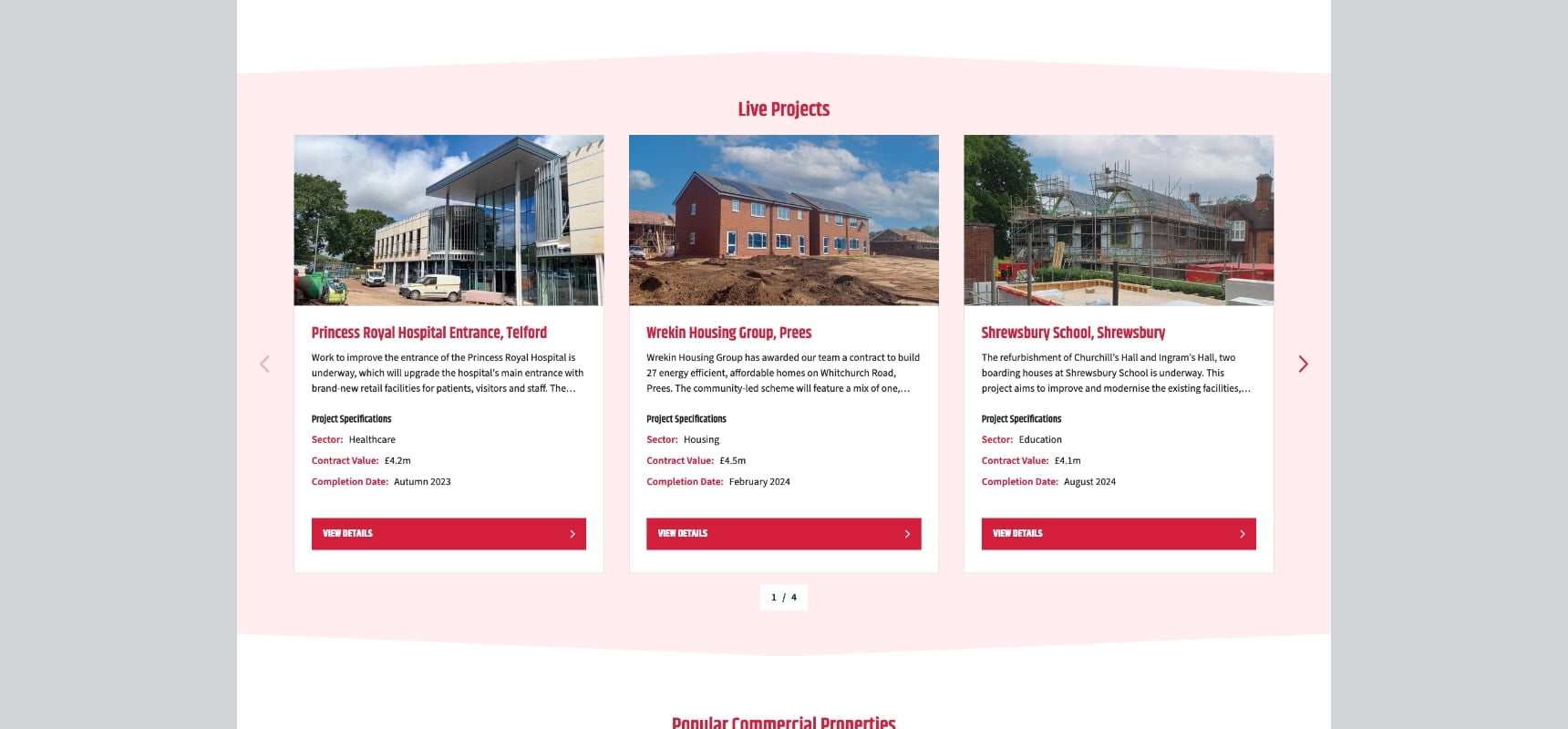
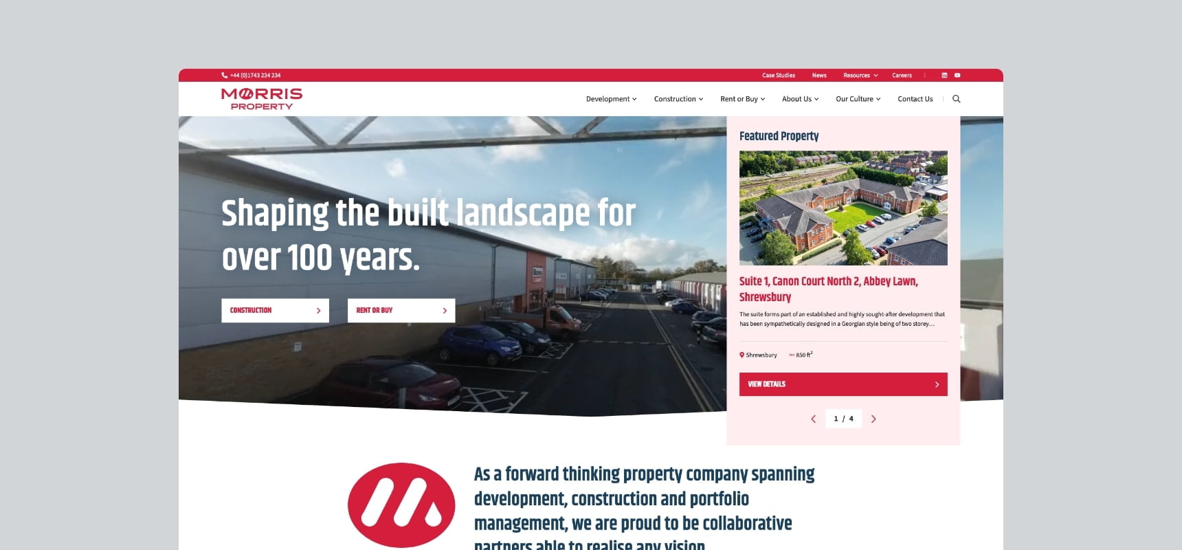
To drive the promotion of the Rent or Buy properties, a key addition to the homepage is the “Featured Property” carousel. This sits above the fold as part of the lead banner, ensuring maximum visibility and encouraging interactions from users. Morris Property can now promote specific properties whilst allowing them to showcase their corporate video.
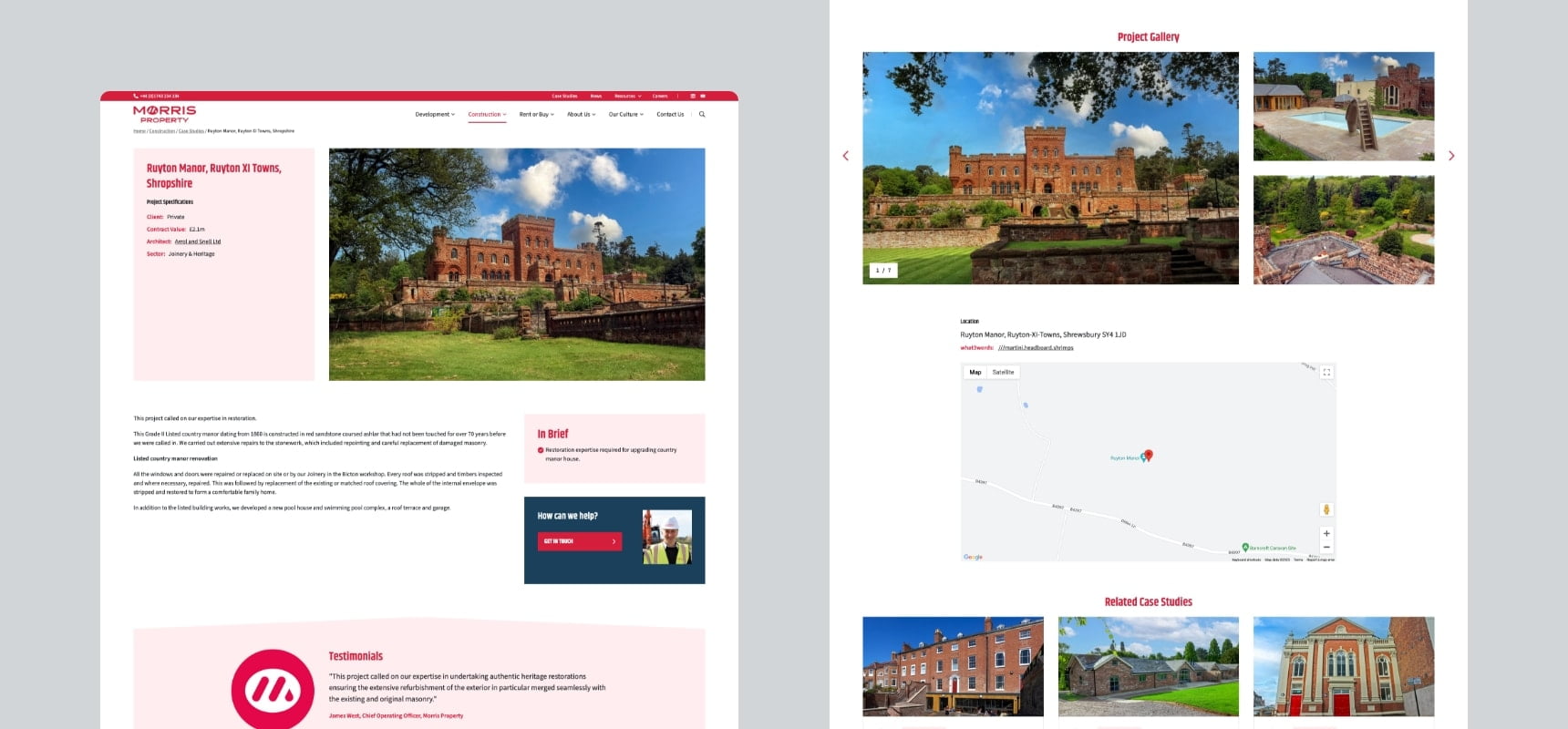
To increase conversion rates on the Rent or Buy pages, we made significant layout changes. This allowed us to structure information in a more accessible and engaging way, and we added multiple calls to action to encourage interaction and drive enquiries.
The results
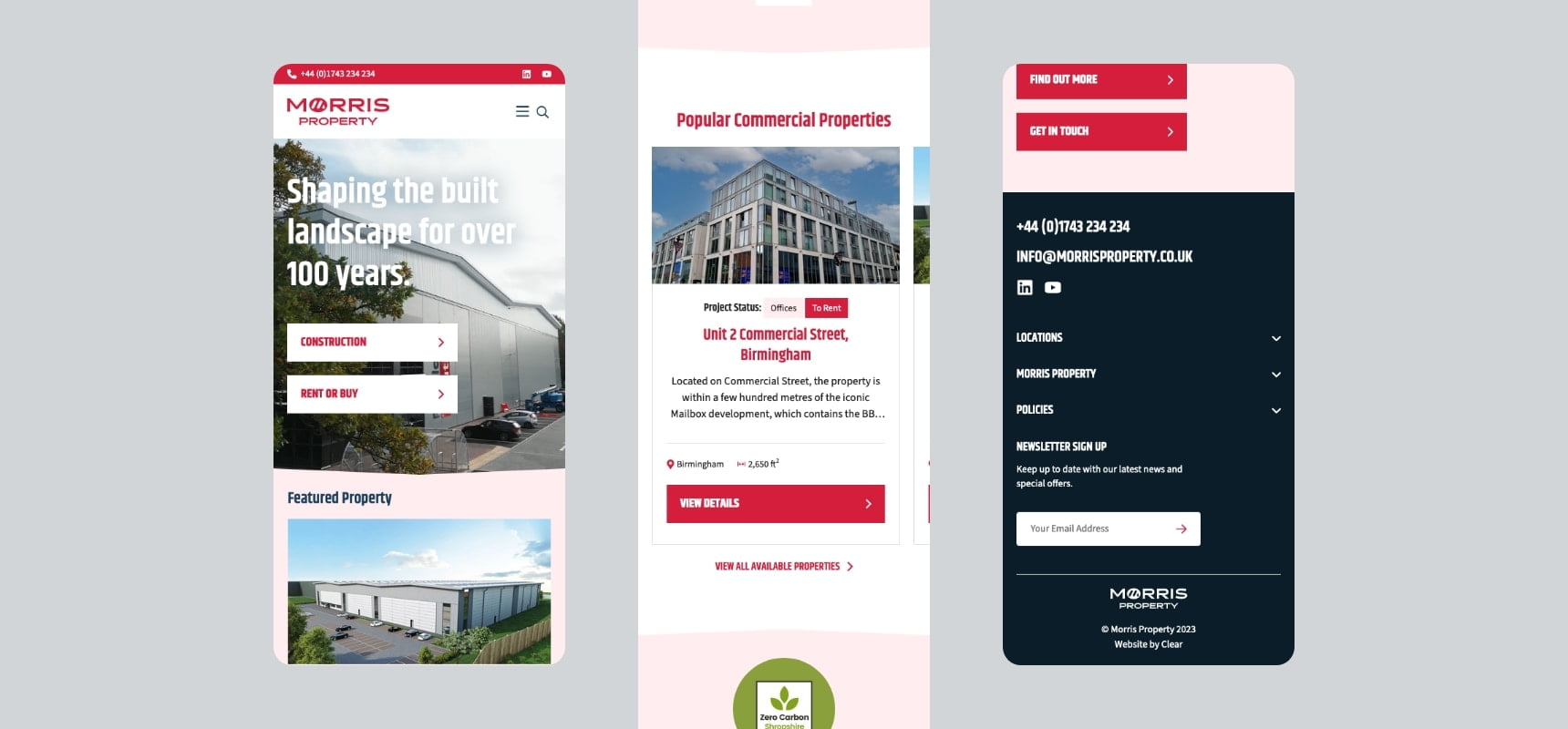
The end result is a modern, accommodating website, that caters to a wide range of users that Morris Property serve. Sensitive preservation of familiar elements, especially on the Rent or Buy pages, helps serve repeat users who could get lost dealing with a wholly new layout.
Alongside this, overhauling other elements of the page templates allowed for better content management and presentation.
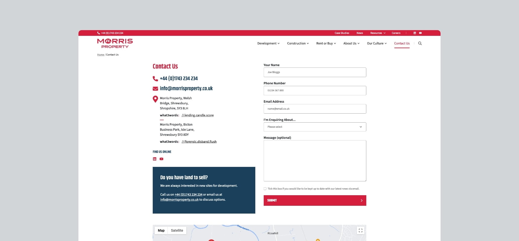
The user journey has been reinforced on the site so people can navigate the site easily. Barriers to the enquiry were minified where possible, and more CTAs were added so each page has a clear objective and users can identify the end journey.
Prominent display of featured properties gives Morris Property greater control and flexibility while showcasing the breadth of the offering.
Let’s chat
Want to take your brand to the next level with an experienced agency that does what they say they’re going to? Get in touch with our team today! We can discuss an upcoming project or simply chat about your business and suggest solutions for growth.
Call us on 01743 344 911, drop us an email or fill out our contact form. We’ll get back to you as soon as possible.
