The review analysed everything from demographics and devices to product filtering and page speed. It was soon apparent that there were fundamental user issues, especially around the navigation and site search.
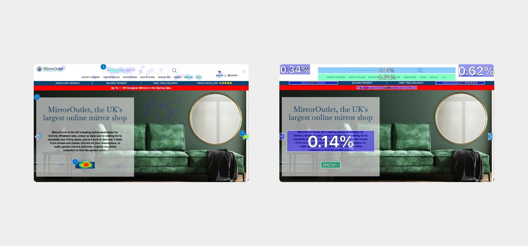
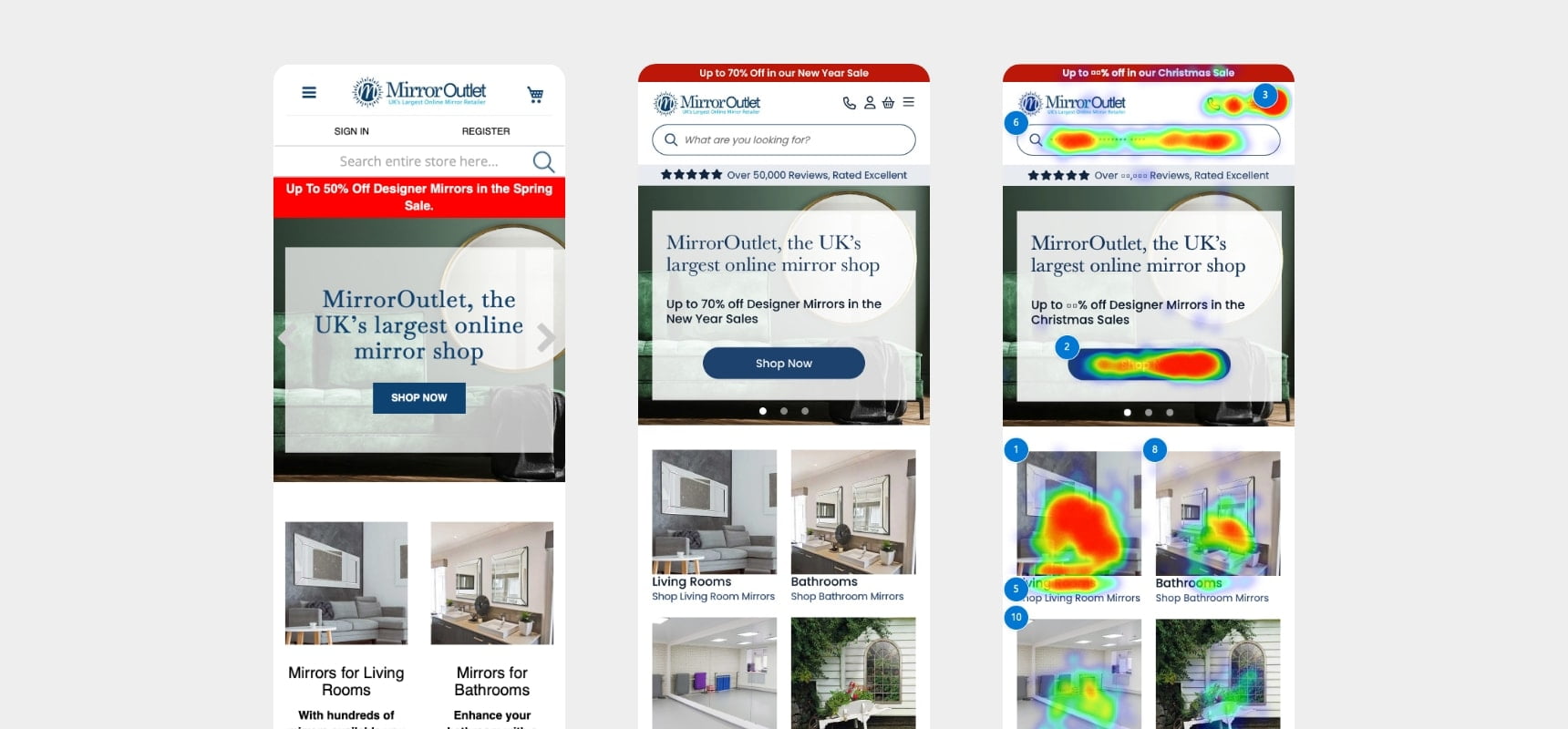
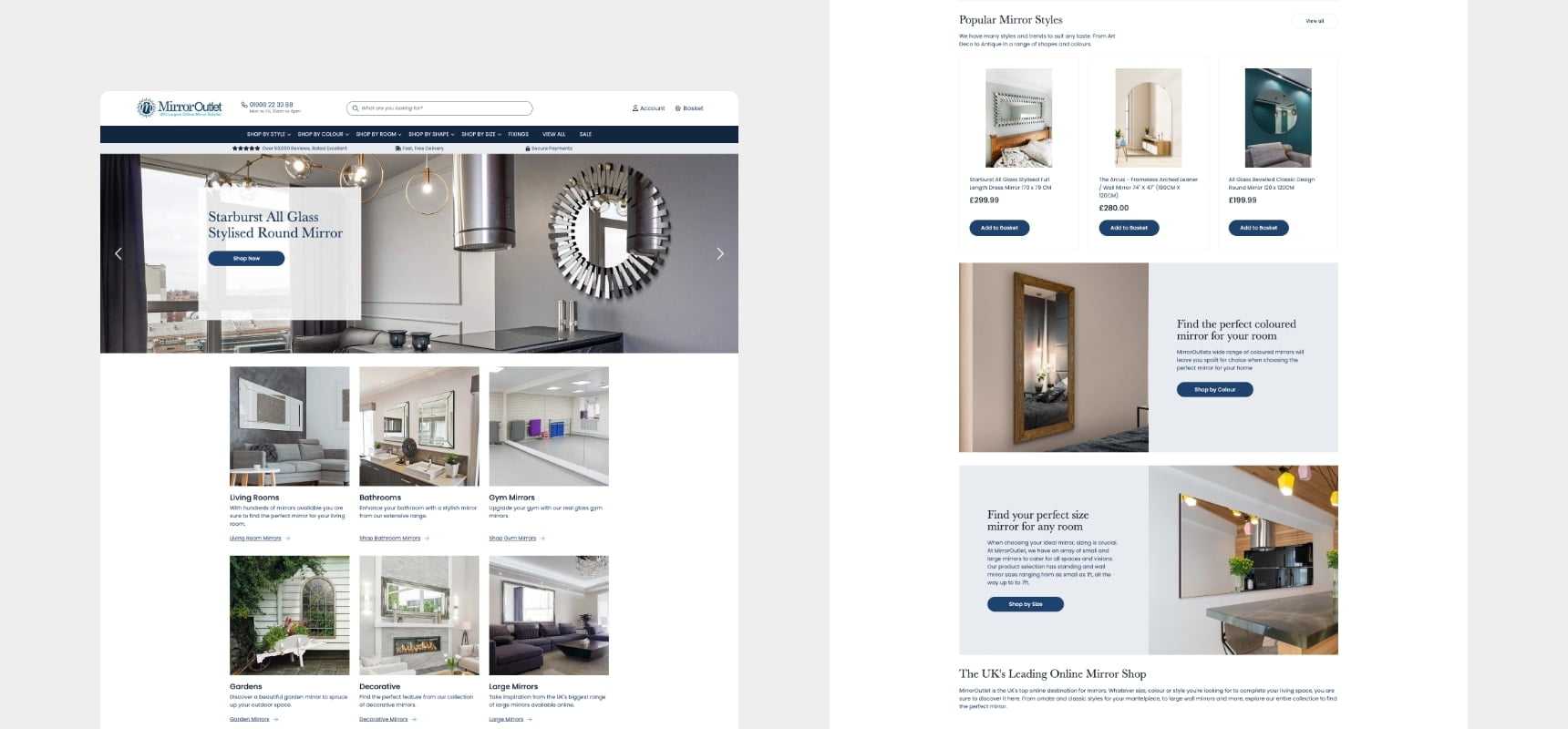
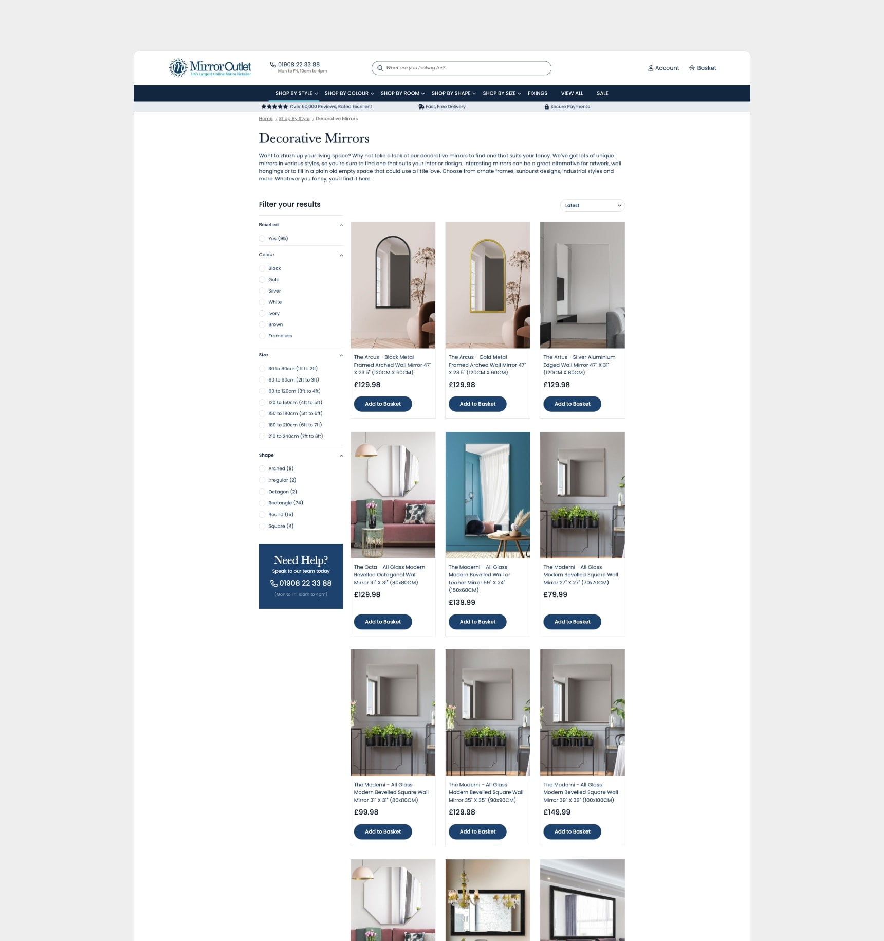
The issues called for a redesign of the header to refocus the primary, secondary, and tertiary navigation and deliver a more expected layout. The promotions bar was moved to the top of the page with the bright red calmed to a softer, richer shade. The search bar was restyled and increased in width, user login and register details were placed into icons to allow the site search to be the star of the show. The original navigation was poorly located, and difficult to locate and use, reordering and placing it in a dedicated space helped to prioritise the most important element of the site. Introducing a trust bar also helped to convey the quality of service.