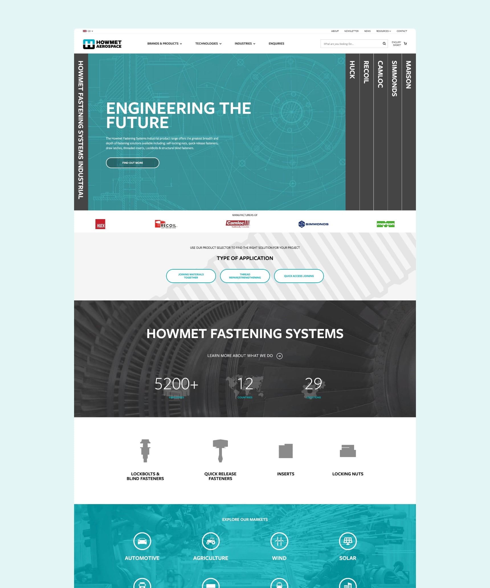
Howmet has been a valued client of Clear’s for many years. In 2018 (then, Arconic), they decided it was the right time to update their global online presence. We helped them to plan and execute a complex project that helped them massively simplify and update their site.
Project background
They previously had around 20 websites in multiple languages to communicate their global offering. Having served them well over the past 10+ years, they were now outdated and difficult to manage, due to the age of the platform they were built on. We recommended it was now time to consolidate the websites into one overarching 'Global Website'.
Due to the mass product offerings, brands, markets and languages that every differing region of Howmet offers, we suggested approaching this project in phases. This would help to ensure the website can be launched in a timely fashion to suit all regions.
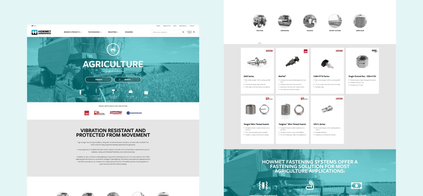
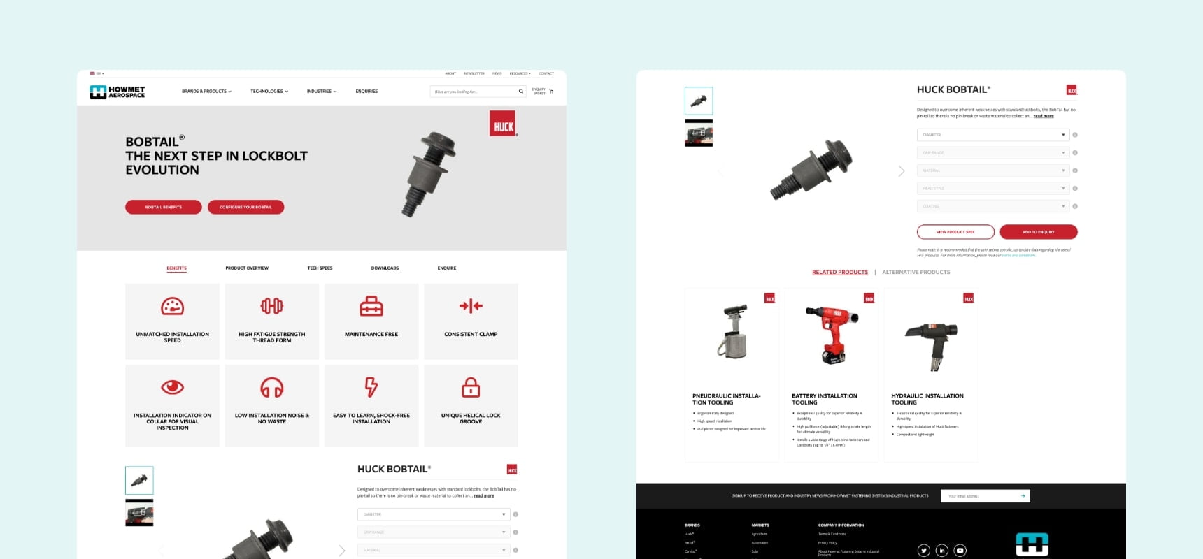
In addition to the marketing content on the site, we had to consider the bespoke functionality that had been built into the previous websites they’d developed over the years and ensure these would be feasible to include on the new site. These included features like product selectors, data capture popups, distributor login areas and support areas.
Our strategy
Despite not requiring a fully-fledged ecommerce site (as they weren’t directly selling online), a Magento 2 site seemed the obvious website platform to opt for. This was primarily due to the wealth of product data that was required to be imported and processed for the ‘product selectors’, along with built-in functionality to accommodate the other desired aspects such as customer group logins etc. It also gave scope for future upgrades and flexibility as needed.
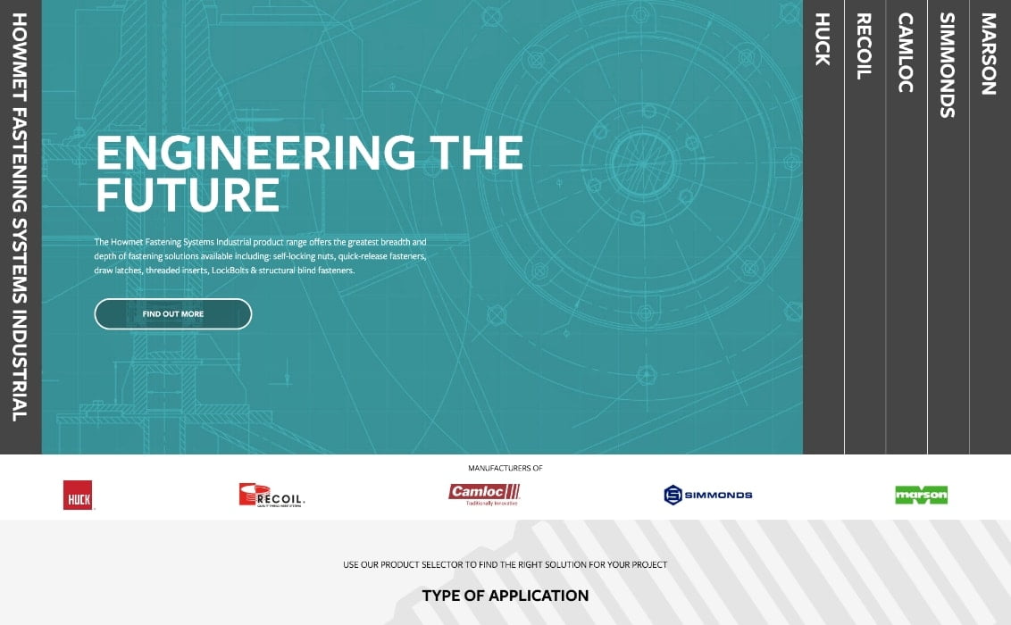
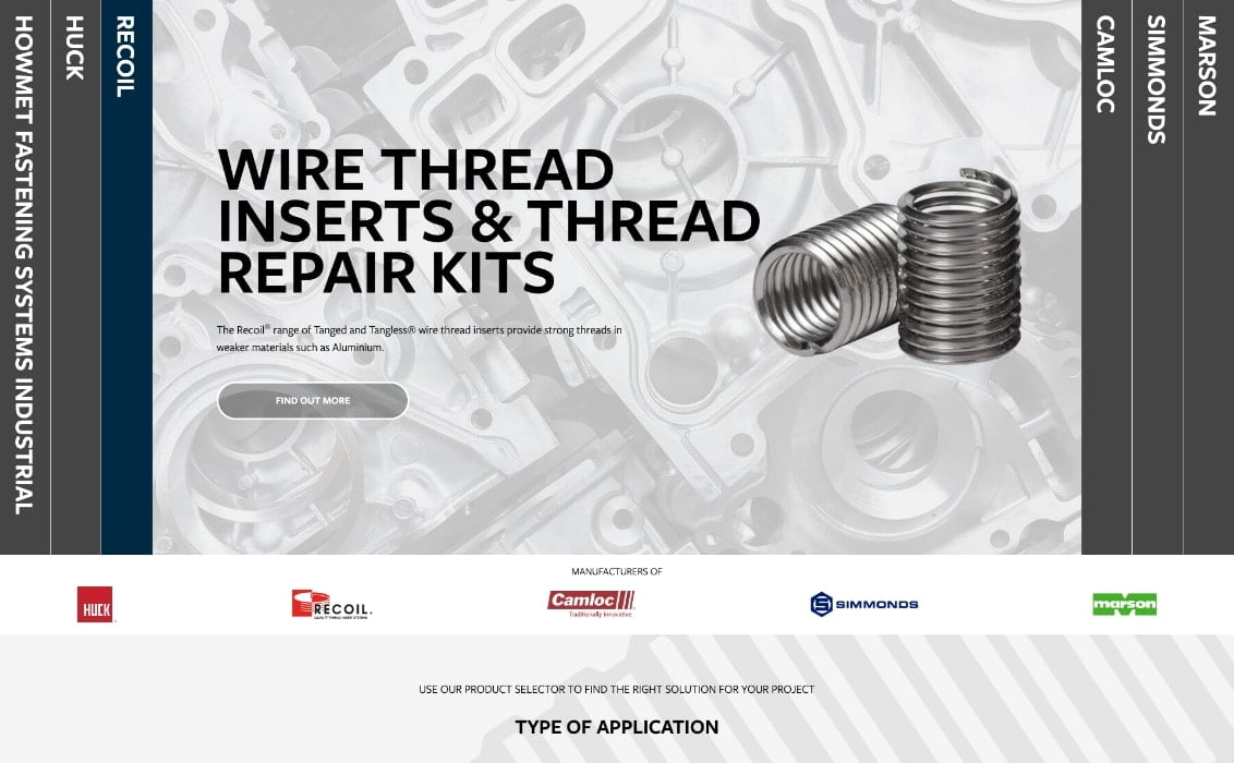
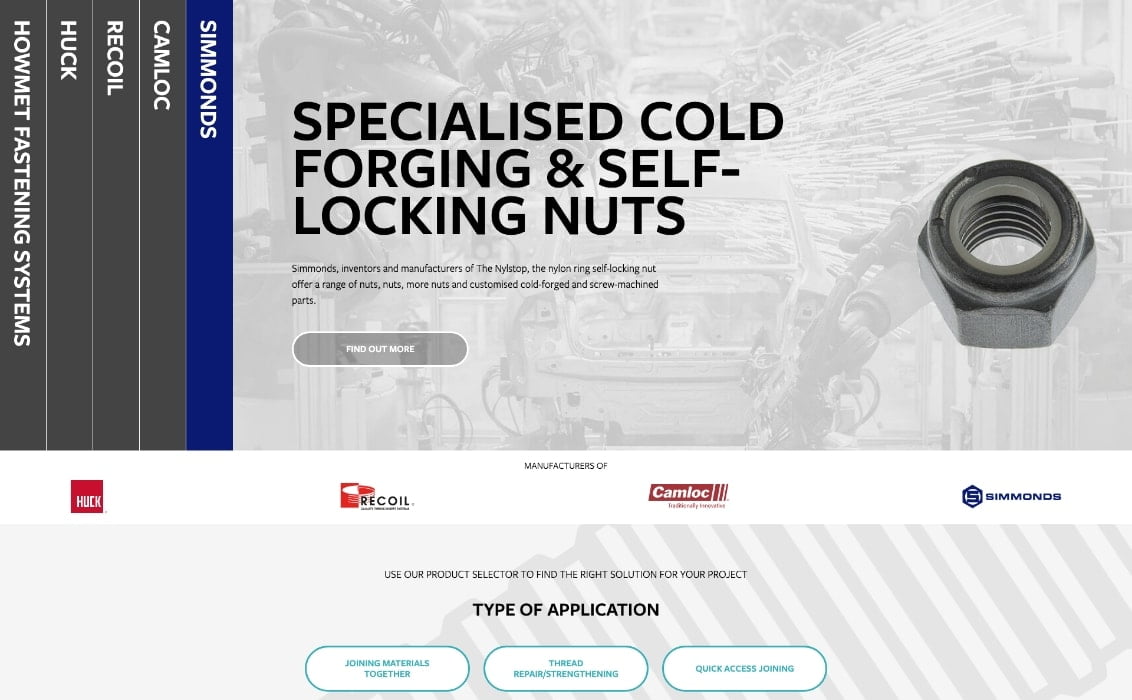
We initially began the project with the UK store view, so we could get an exemplar ‘site’ together while working closely alongside the Arconic UK team. The initial design and build placed a heavy focus on the differing brands and their product offerings, along with the markets they operate in. The ultimate aim of the site was to provide information to the user, as well as drive product enquiries. The ‘product selectors’ – which are essentially complex enquiry-only ecommerce configurable products – formed a heavy base for this; allowing users to easily identify a product part they require, without having to trawl through copious amounts of data!
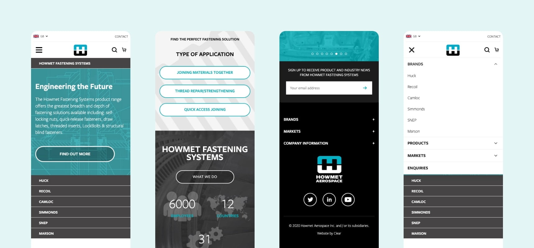
Once we got the UK store view up and running, we again worked with the UK team to launch the FR and DE sites. These mirrored the UK site - re-instating the global image – and were updated to have the correct national languages.
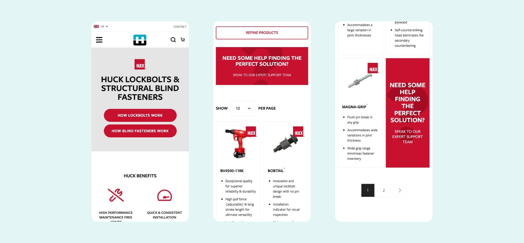
When moving onto the US store view, it became clear they required a heavier focus on the ‘marketing’ side of things for their audience, as opposed to the information-driven store views Europe required. We then worked with them to update the site’s build to accommodate this.
But that’s not all! We’re now moving on to later phases of the project. From further regional sites (such as AU and China) to distributor portals and resource download centres. A key to a good website – is constant evolution and adaptation.
Let’s chat
Want to take your brand to the next level with an experienced agency that does what they say they’re going to? Get in touch with our team today! We can discuss an upcoming project or simply chat about your business and suggest solutions for growth.
Call us on 01743 344 911, drop us an email or fill out our contact form. We’ll get back to you as soon as possible.
